炙序|Brand Design
Branding
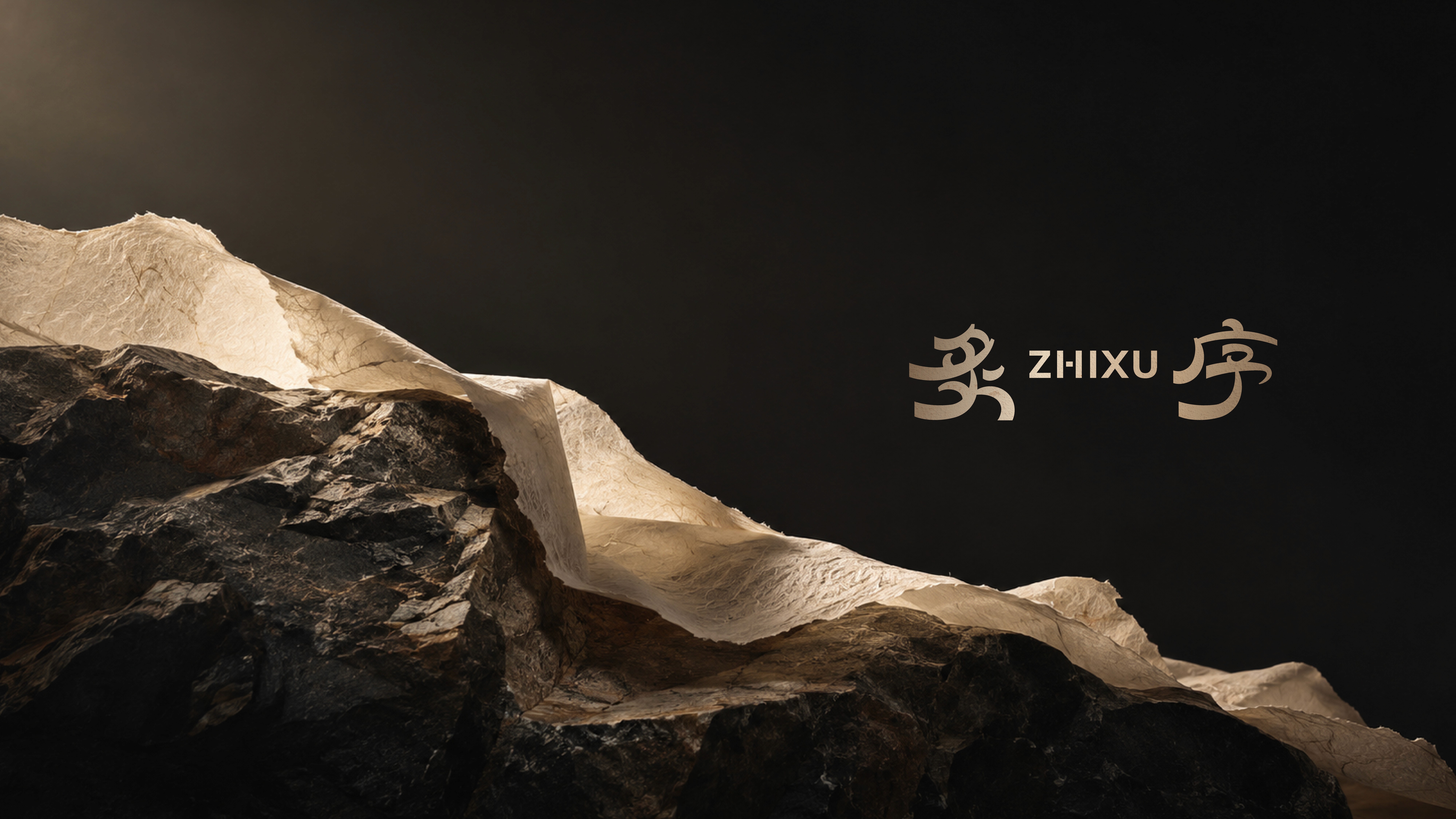
「炙序」以料理中的「技」與「序」為品牌核心,思考傳統進入今日之後,如何以新的方式被理解與延續,「炙」,代表料理的技法。從刀工、火候到調味,食材經由人的掌握而產生變化;「序」,則是料理之中看不見的秩序,關乎時節、先後與分寸。一道菜如何成味,一席料理如何展開,皆有其法,也有其序。
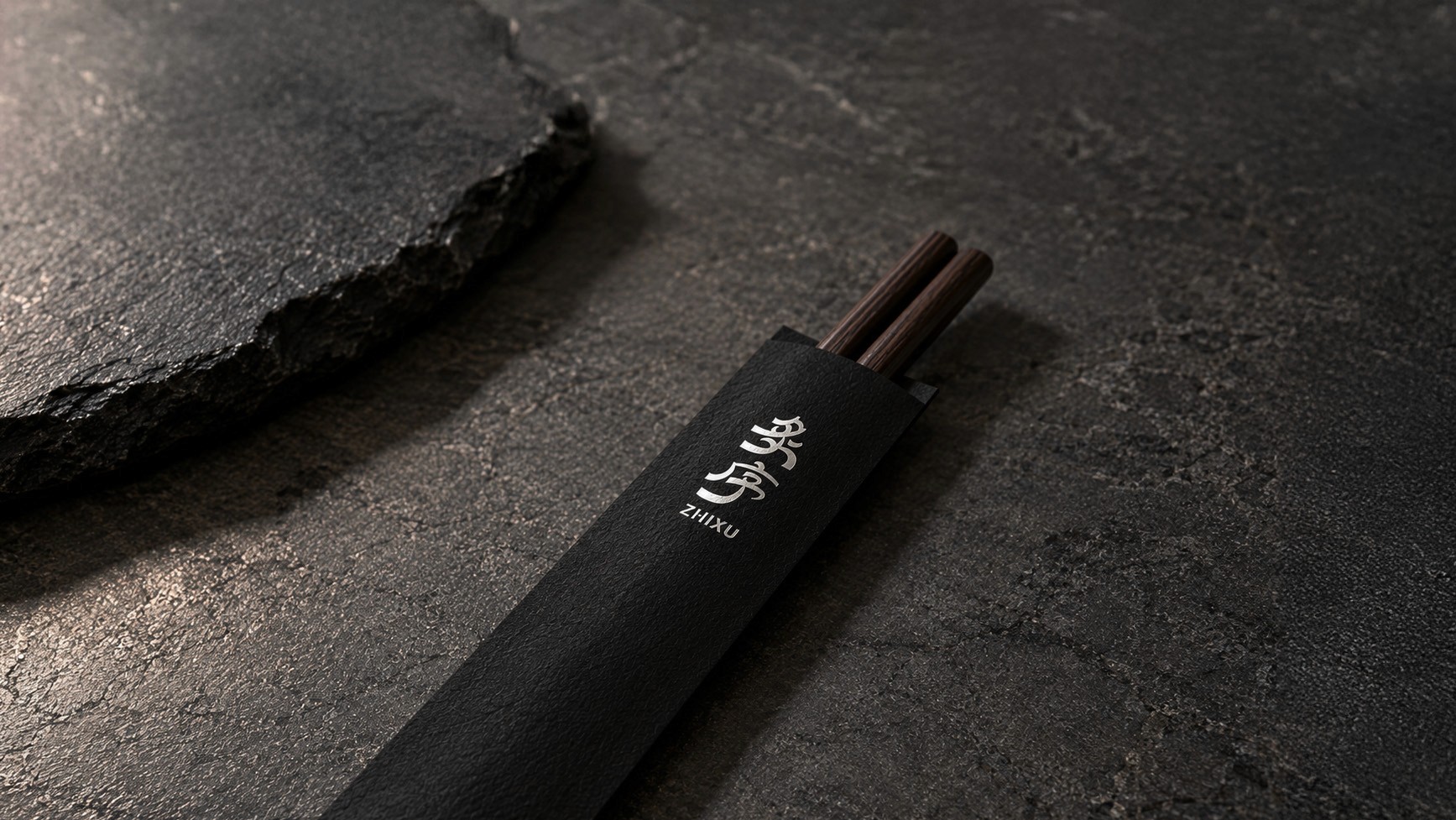
品牌識別從古字結構出發,取文字之骨,保留東方文字的結構與張力,再以線條重新構成,在傳統與今日之間建立新的視覺語言。
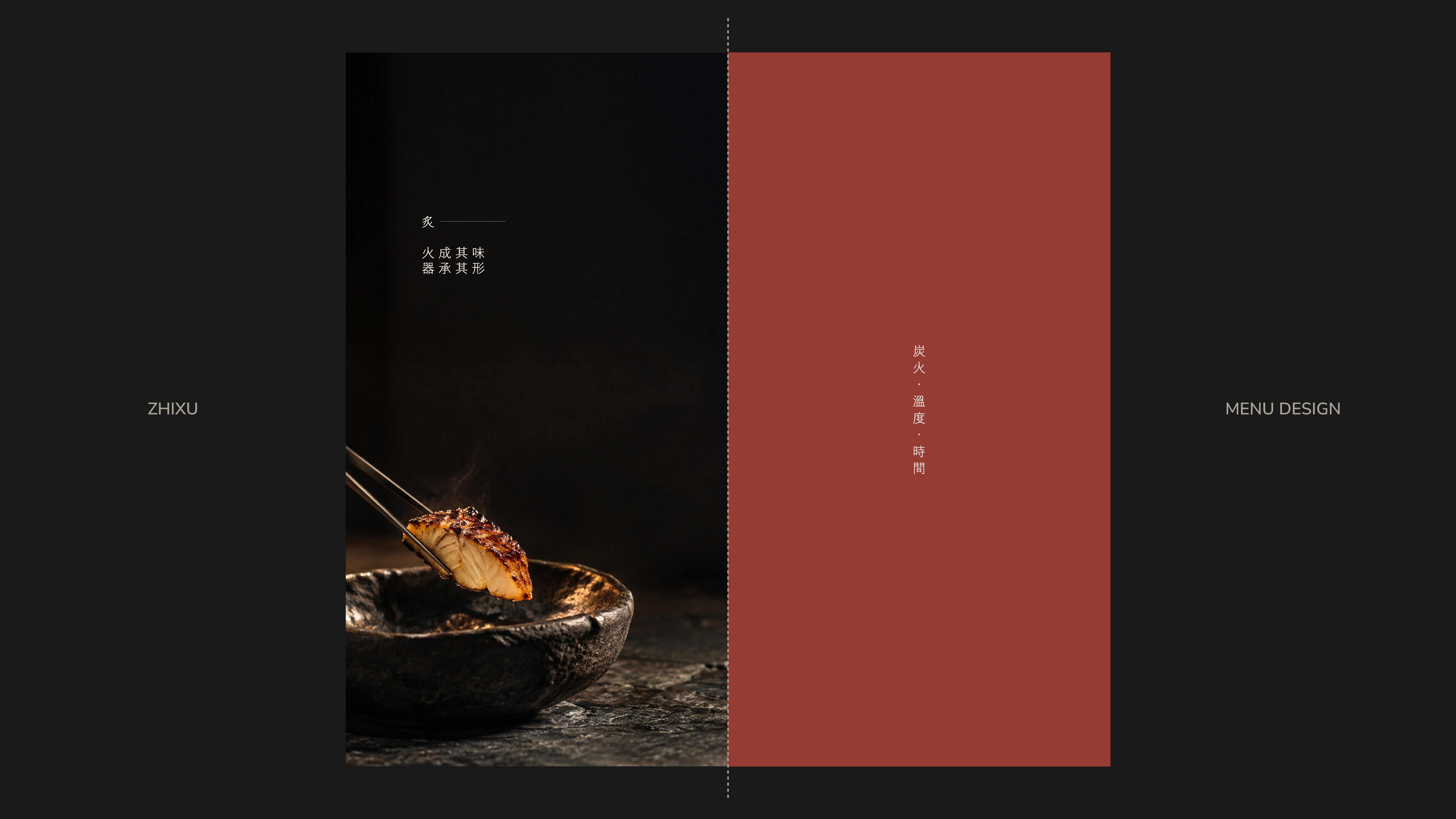
品牌進一步以「時・法・序」建立料理哲學——順時取材、循法成味、依序成席。「時」回應食材與季節的流轉;「法」承接刀工、火候與烹調的技藝;「序」則關乎味道、溫度與上菜先後所形成的一席節奏。
取字之格,成料理之序。以「格」作為品牌最小的視覺單位,從文字的結構、古籍的版序與料理的秩序之中提取共同邏輯,轉化為當代的模組系統。相同的方格,透過排列、間距、方向與疏密的變化,構成「時・法・序」各自的圖形,也象徵料理之中看似細微,卻精準影響整體的關係。
視覺色取材自「火、石、紙、器」。火,代表技法與溫度;石,呈現克制與當代性;紙,承載時間與記錄;器,回到一席料理的盛裝與文化,將傳統的質地保留下來,卻不直接複製傳統的形式。
炙序不復刻傳統的形式,而是從料理與文化留下的結構中,尋找能被延續的方法。
ZHIXU is built around two ideas: craft and order, exploring how Chinese culinary traditions can be reinterpreted for today.
“ZHI” represents the craft of cooking—from knife work and heat control to seasoning. “XU” represents the invisible order behind cuisine: seasonality, sequence, balance, and restraint.
The identity draws from the structure of ancient Chinese characters, preserving their underlying form while rebuilding it with contemporary lines. It creates a visual language between tradition and the present.
The brand philosophy is defined by three principles: Time・Craft・Order — seasonal ingredients, culinary techniques, and the rhythm of a complete dining experience.
The visual system uses the grid as its smallest unit. Inspired by Chinese character structures, traditional book layouts, and culinary order, the grid is transformed through spacing, direction, and density to create the symbols of Time・Craft・Order.
The visual palette draws from Fire・Stone・Paper・Vessel. Together, they represent technique, restraint, time, and dining culture—preserving the spirit of tradition without reproducing its form.
ZHIXU does not recreate tradition. It preserves its structure and reinterprets it for today.



RECENT PHOTOS