旬日|Brand Design
Branding


旬白|順應時旬,留白於味
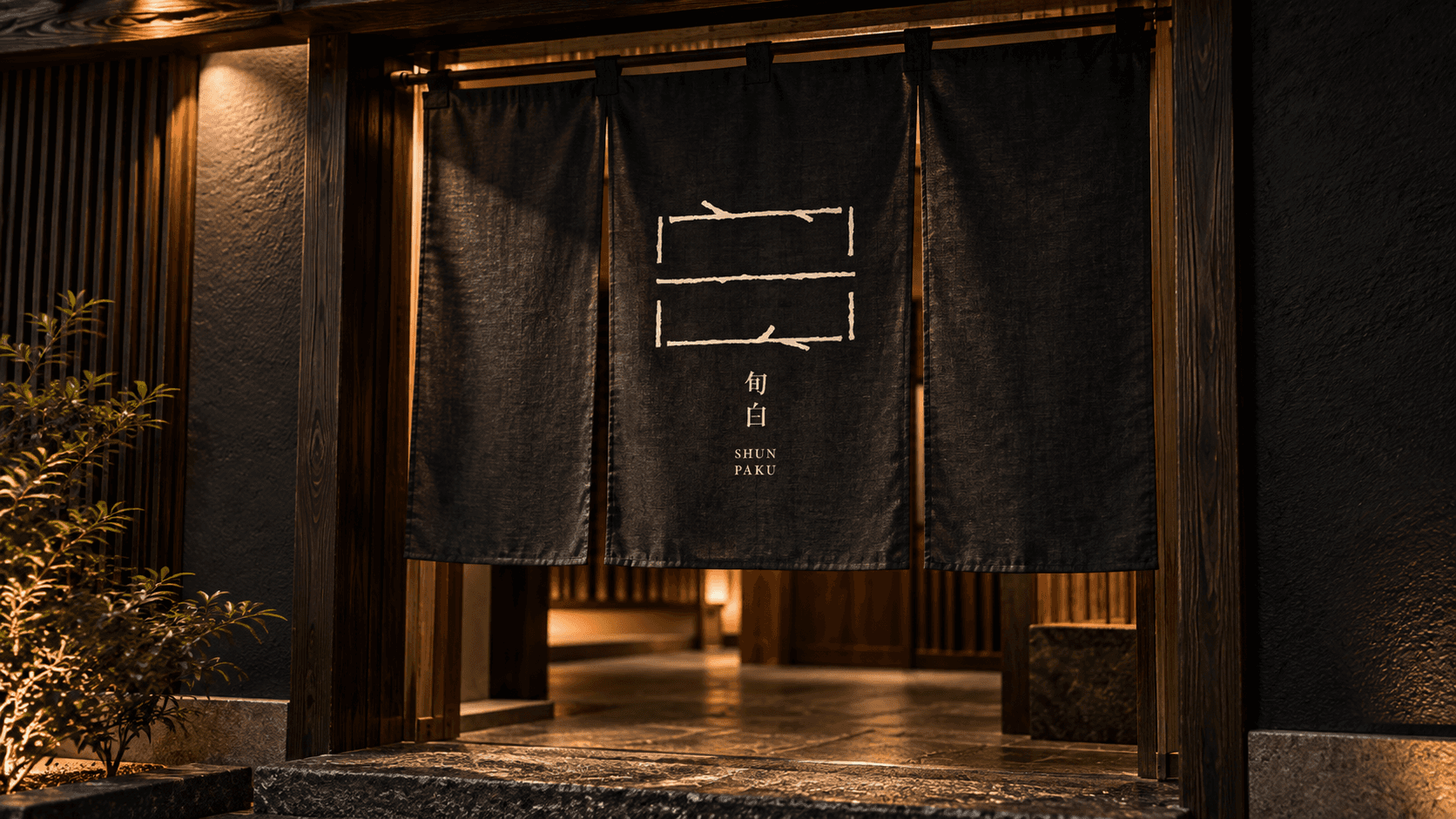
「旬白」以「白」為識別原型。
白,象徵純粹,也代表留白。將料理的主角留給食材本身,也為每一次用餐保留感受與想像的空間。
識別字形刻意保留開放、未封閉的結構,如同一席等待季節進入的空間;延伸於字形之上的枝枒,取自自然生長的姿態,像是四季悄然留下的痕跡,在理性的框架中注入自然與生命感,也呼應旬白對當旬食材與細微季節變化的重視。
不刻意訴說季節,而是讓人從一道料理、一種食材與一席之間,自然感受此刻的旬味。
印刷選用帶有粗糙纖維與自然紋理的紙材,搭配局部燙銀,使枝枒與圖像隨著光線與觀看角度若隱若現,如同四季無聲更迭。從視覺、觸感到光影,讓「旬」不只被看見,也以細微而自然的方式被感受。
SHUN PAKU|In Season, With Space to Savor
Shun Paku takes “Paku” (白, white) as the foundation of its visual identity.
White represents purity, but also emptiness — leaving space for the ingredients to take center stage, while allowing each dining experience to unfold with its own sense of imagination and discovery.
The identity features an intentionally open and incomplete structure, creating a space that welcomes the changing seasons. Delicate branches extend across the geometric form, inspired by the organic growth of nature. Like subtle traces left behind by each season, they bring warmth and vitality into an otherwise rational framework, reflecting Shun Paku’s appreciation for seasonal ingredients and the quiet nuances of time.
Rather than explicitly describing the seasons, Shun Paku allows them to be experienced naturally — through a dish, an ingredient, and the moments shared around the table.
For the printed materials, textured paper with visible natural fibers was selected to introduce a tactile, organic quality. Subtle silver foil details shift between presence and disappearance as light and viewing angles change, echoing the quiet transition of the seasons. Through visual form, texture, and light, the idea of “Shun” — the season at its finest moment — becomes something not only seen, but felt.


RECENT PHOTOS


